


Last week I looked at some general colour terms and laid out how I'll be covering things. I also discussed some of the factors like Primer and Lighting that end up affecting how colours look when we paint them.
This week I'm going to concentrate on some of the things we should look at while painting like Contrasts and Symmetry, ending with some generic tips.
"Contrast" is a term you're going to see me use a lot. Paying attention to how colours, shades and highlights compare to each other will strongly impact how good your miniature looks by making the right things pop out. A bold miniature can stand out against a muted background, base or terrain and you can make details pop out to the viewer if they're surrounded by dull colours.
 |
| Left: Contrasting Backgrounds: The miniature stands out against the faded background. Right: Contrasting Lighting: Shadows and Highlights make all the other colours stand out. Krielstone Warlock (Nemesis) and Mulg the Ancient of the Hordebloods |
 |
| Left: Single coat of paint. Right: Only difference is adding a wash. 3-Step Painting with White Primer |
Too many times, beginners apply a single layer of paint and call it quits. Trust me on this, pick up some washes because they'll make a huge difference very easily and quickly.
A wash is a paint that's very watery and can be sloppily brushed over a large area without concern. It's thin enough that the paint it's applied over is still visible, but slightly darker. Most of the wash will pool in areas like crevices and creases; anywhere shadows naturally appear.
Matching the colour of the wash with what you're painting over will have the best results - Green wash on Green paint, Blue on Blue, etc. A Brown wash works well on Yellows, Oranges and Red. (And most everything else really.) Metallics work best with a Black wash but can look interesting if you use Brown or Blue.
Top Heavy Painting
 |
| Created with painter from Bolder & Chainsword |
If you paint a top-heavy miniature, eyes will be drawn away from the base.
Using the image on the left as an example, you can see your eyes have a hard time knowing where to look.
 |
| Asymmetrical source |
Symmetry can be boring. Throwing off this Balance is called Asymmetry. It can be tricky, but rewarding if you can.
A model can be symmetrical, but painted asymmetrical. It can also be sculpted asymmetrical but painted symmetrically.
Painting Flesh and Accessories with Colour Theory
- Cheat
- Paint skin, bags, jewelry, etc, however you want.
- All this is to help express yourself, not restrict.
- Feel free to just apply the colour scheme to armour, clothes, vehicles, etc.
- Be true to the colour scheme
- Use olive military cloth for leather, backpacks, etc. While Grey and Black are fine for armour, other metallic paints (Yellow = Gold) or painted metal can also be used.
- Flesh can be painted alien or beast-like.
- Be true, except for flesh.
- Use natural skin tones.
- If you have models that are mostly flesh, your skin will overtake whatever style you've chosen.
- Apply colour schemes to specific aspects of your model, not the entire miniature.
- Ex: If you're just looking for a way to paint clothes or armour.
- Use multiple schemes in one piece.
- Hard, but if the colour schemes you choose are pleasing, feel free to mix.
 |
| Guardians of the Galaxy |
What do colours mean?
 Colours can create first impressions or an overall feel. I'm not going to go in to a ton of detail on colour meanings, so if you want more information, take a look at Colour Wheel Artist - Colour Meanings. (My source for the below descriptions.) As you read through them, you may notice that armies you're used to already incorporate some of these aspects.
Other cultures can associate colours with meanings contrary to that which we're used to. Looking up the meaning of a colour can provide unique inspirations when we're painting armies from other parts of the world. For example, Yellow is associated with mourning in Egypt.
I'll go in to more detail on it later, but be aware that colours are associate with being "warm" or "cool." Yellow, Orange and Red are considered warm and intense while Green, Blue and Violet are considered cool and relaxing.

Using Adobe Color CC to Test Paint Schemes
Adobe Color Creative Cloud is a FREE site, previously known as Adobe Kuler, that lets you plan colour patterns based on standard or custom colour rules. I've played with a few other sites, but either found them lacking or inaccurate.
 To begin, choose a Colour Rule from the drop down.
If you choose "Custom" then you have the ability to manually change all 5 of the below colours to see what they look like side by side and what their values are.
Next, choose your main colour. (Green in the below example.)
To do this, click the middle square, then drag the highlighted circle in the colour wheel to your desired colour. As you drag, all the other colours will update too.

 If a colour isn't quite what you're after, you can choose it and adjust the values.
As long as your Colour Rule is something besides Custom, it'll shift all your other colours while adjusting these values. Again, the Custom rule means you get to customize every colour independently of the others. While adjusting these with a non-Custom rule changes the others, this is how you make a colour darker - you'll just have to move the main colour back to where you want it after.
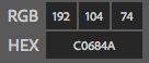 When you're done, it will also show you the RGB and Hex codes of the colours if you want to use them in a photo editor or website.
Alternative - Spektran is another website that offers some pretty cool options for choosing colours.
BONUS - Cyanometer
(Because there wasn't anywhere better to put this.)
This is a tool that allows you to measure the colour of the sky.
Print the template on the right and cut out the middle. Then, hold it up to the sky and mark which colour matches best.
Not directly helpful to us, but if you were trying to recreate the sky for a specific reason, this is how.
Other cultures can associate colours with meanings contrary to that which we're used to. Looking up the meaning of a colour can provide unique inspirations when we're painting armies from other parts of the world. For example, Yellow is associated with mourning in Egypt.
I'll go in to more detail on it later, but be aware that colours are associate with being "warm" or "cool." Yellow, Orange and Red are considered warm and intense while Green, Blue and Violet are considered cool and relaxing.
- Yellow
- Spirituality, Luminosity, Happiness, Optimism, Intuition, Manifestation, Opportunity, Awareness, Wisdom, Intelligence.
- Cowardice, Deceit, Illness, Emergency
- Orange
- Tends not to have positive or negative meanings.
- Social, Exuberant, Youthful, Adventurous, Energetic without Aggression, Creative, Good Health, Exciting, Warm
- Frivolous, Flamboyant, Loud, Low Class
- Earthy as it approaches tans and browns.
- Red
- Virility, Sex, Passion, Love, Heat, Daring, Boldness, Independence, Action, Energy, Speed, Excitement, Vitality, Courage, Strength.
- Danger, Evil, Aggression, Violence, Death, Blood, Martyrdom, War, Revolution.
- Women tend to prefer cool-Reds that approach Violet and tinted-Reds that are lighter.
- Men tend to prefer warm-Reds that approach Orange and shaded-Reds that are darker.
- Violet
- Royalty, Luxury, Spirituality, Mysticism, Ritual, Subconscious, Creativity, Imagination, Passion, Sensitivity, Calming, Contemplative, Bravery.
- Conceit, Death, Mourning, Cruelty, Arrogance, Instability, Eccentricity, Immaturity, Entitlement.
- Meaning can be strongly influenced whether this Hue leans toward Red or Blue and the rest of the colours you use can cement or offset this.
- Women tend to prefer tinted-Violets that are lighter.
- Men tend to prefer shaded-Violets that are darker.
- Blue
- Spirituality, Serenity, Vastness, Cleanliness, Unconscious, Calming, Fidelity, Trust, Intelligence, Technology, Futurism.
- Sadness, Insubstantial, Cold, Aloof, Formal, Immoral, Chilling, Old-Fashioned, Authoritarian, Conservatism.
- Dark: ultra-masculine, success, authority, corporate.
- Crisp: calming, water, spacious.
- Green
- Nature, Conservation, Environment, Growth, Renewal, Cleanliness, Health, Youthfulness, Peace, Tranquility, Balance, Relaxation, Joy, Security, Prosperity.
- Jealousy, Inexperience, Illness, Rotting
- Negative meanings often associate with Green that has more Yellow.
- Relaxing meanings often associate with Tints and Tones. (Mixes of White or Grey.)
- Dark: masculinity and mystery.
Using Adobe Color CC to Test Paint Schemes
Adobe Color Creative Cloud is a FREE site, previously known as Adobe Kuler, that lets you plan colour patterns based on standard or custom colour rules. I've played with a few other sites, but either found them lacking or inaccurate.
If you choose "Custom" then you have the ability to manually change all 5 of the below colours to see what they look like side by side and what their values are.
Next, choose your main colour. (Green in the below example.)
To do this, click the middle square, then drag the highlighted circle in the colour wheel to your desired colour. As you drag, all the other colours will update too.
As long as your Colour Rule is something besides Custom, it'll shift all your other colours while adjusting these values. Again, the Custom rule means you get to customize every colour independently of the others. While adjusting these with a non-Custom rule changes the others, this is how you make a colour darker - you'll just have to move the main colour back to where you want it after.
When you're done, it will also show you the RGB and Hex codes of the colours if you want to use them in a photo editor or website.Alternative - Spektran is another website that offers some pretty cool options for choosing colours.
 |
| source |
(Because there wasn't anywhere better to put this.)
This is a tool that allows you to measure the colour of the sky.
Print the template on the right and cut out the middle. Then, hold it up to the sky and mark which colour matches best.
Not directly helpful to us, but if you were trying to recreate the sky for a specific reason, this is how.
 |
| source |
| PREV: Introduction Part 2 | NEXT: Complementary Colours |
| This series on Colour Theory is intended to broaden our ability to paint interesting, unique or uniform miniatures. You'll learn how to choose pleasing combinations of colours and how to make certain accents or details stand out. Visit the Colour Theory Index for links to the rest of this series. For more in-depth tutorials for Beginner and Experienced miniature hobbyists, visit Wargaming Tradecraft. | |
No comments :
Post a Comment
Please keep all comments civil and language appropriate for a child-safe environment.