


 Paying close attention to the colours we use while painting miniatures will go a long way to producing visually pleasing works of art. Your models can stand apart from other peoples by using methods you'll read about here.
Even if you don't care about creating masterpieces, colour theory will help finalize details. From minor decisions like what to paint final bits to choosing a cohesive look for a new army.
This is a 5-month series I've written for House of Paincakes and the first article was posted there yesterday. In addition to my regular content posts, I'll be mirroring each one here on the following week's Friday, but for now can join the discussion today!
Disclaimer 1 - This is all Subjective
Not everyone agrees on what looks good, or what colours go together - but you should be painting for yourself, right?
Disclaimer 2 - I'm Self Taught
I haven't gone to school for art, I'm just someone who's done a bunch of research and tried to pay attention to these things. I've made a point of keeping these articles easy to read, so I've also left out some of specifics and nuances. If you're looking for more information on any of the topics, I recommend googling yourself as there's a lot out there.
Index
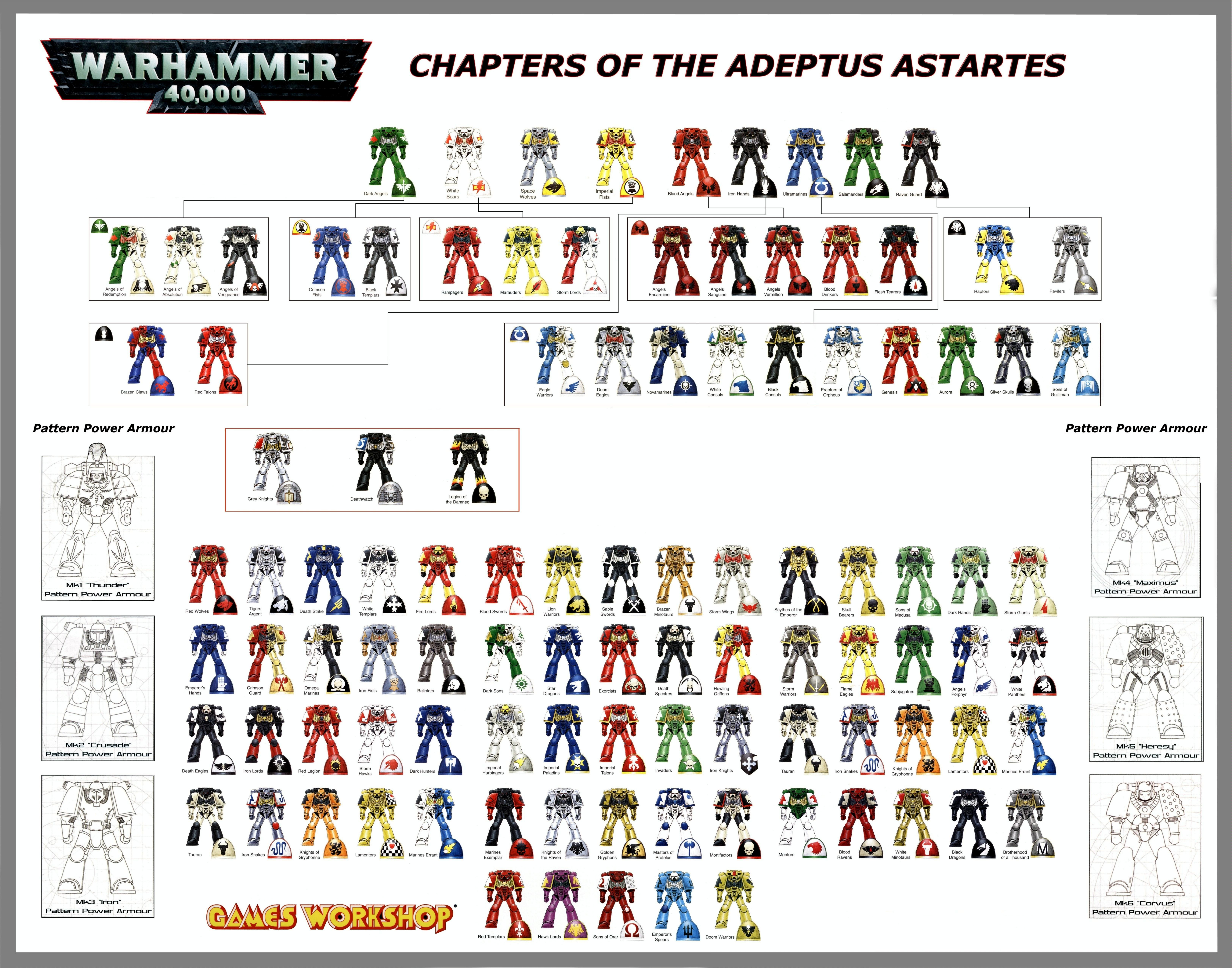
The following is an outline of each of the topics I'll be covering. As I write them, I'll update this index to link to the full articles. Each one will discuss the style, point out benefits of using it, offer tips on how to paint it and demonstrate works in progress as I paint a miniature in this style. As a wrap up, I'll take a look at how Games Workshop and Privateer Press employ colour in Warhammer 40k, Warmachine and Hordes.
I haven't gone to school for art, I'm just someone who's done a bunch of research and tried to pay attention to these things. I've made a point of keeping these articles easy to read, so I've also left out some of specifics and nuances. If you're looking for more information on any of the topics, I recommend googling yourself as there's a lot out there.
Index
The following is an outline of each of the topics I'll be covering. As I write them, I'll update this index to link to the full articles. Each one will discuss the style, point out benefits of using it, offer tips on how to paint it and demonstrate works in progress as I paint a miniature in this style. As a wrap up, I'll take a look at how Games Workshop and Privateer Press employ colour in Warhammer 40k, Warmachine and Hordes.
 |
Colour Theory Introduction (Part 1) I look at general artistic theories, terminology and how things like Primer and Lighting affect how paints end up looking. Colour Theory Introduction (Part 2) Expanding on last week, adding tips for making colours stand out, applying these ideas and some extra things like the Meaning of Colours. |
 |
Complementary Colours Colours directly opposite each other on the colour wheel create the strongest contrast. Use these colours to make details really pop out. |
 |
Analogous Colours Colours next to each other on the wheel blend naturally and feel comfortable. |
 |
Warm Colours Yellow, Orange and Red are strong, intense colours that jump out at the viewer. Great for bold and vibrant themes. Cool Colours |
Green, Blue and Violent are soothing, comfortable colours that fade to the background. Great to create calming, less energetic scenes. |
|
 |
Split-Complementary Colours Slightly less contrasting than normal Complementary an extra colour to work with, two of which that work well together.. |
 |
Triadic Colours An evenly spaced, vibrant and harmonious theme. |
 |
Rectangular Tetradic Colours A four colour theme made of two sets of Complementary colours. This gives more variety of colours to paint with, while still offering bold contrasts. You can choose for the near colours to be either both be warm and cool or the near colours to be warm and cool. This creates a different feeling depending on which way you go. |
 |
Square Tetradic Colours Similar to the Rectangular Tetrad, but evenly spaced. |
 |
Colour Contrast and Context Looking at how colours can appear different depending on their surroundings. |
 |
Achromatic (Greyscale) Painting with the absence of colour and contrasts. |
 |
Near-Neutral Achromatic Mixes with lots of White, Black and Grey until you can barely tell what the original colour was. Often called "Earth Tones." |
 |
Monochromatic Using a single colour mixed with White, Black and Greys. |
 |
Contrasting Achromatic Adding a touch of colour to grey paintings in order to make specific details stand out. |
 |
Colour Theory in 40k and the Iron Kingdoms Looking at some of the factions and what colour theories have been used to come up with their colour schemes. I'll also briefly discuss some of the differences between how Games Workshop and Privateer Press seem to approach their choice in colours. |
Useful Links
- http://www.color-wheel-pro.com/color-schemes.html
- http://www.tigercolor.com/color-lab/color-theory/color-theory-intro.htm
- http://www.color-wheel-artist.com/
- http://www.handprint.com/HP/WCL/color13.html
- http://www.handprint.com/HP/WCL/color15.html
- http://images.dakkadakka.com/s/i/gallery/img/2010/1/10/75422.jpg
- http://www.bolterandchainsword.com/smp.php
No comments :
Post a Comment
Please keep all comments civil and language appropriate for a child-safe environment.