


 This is a simulated look using colour to fake a metal appearance. As an example, using greys for silver, blues for steel and yellows for gold. You might also hear it referred to as a "European" method of painting due to its wider contrast and softer blending.
Honestly, NMM isn't much more difficult than painting any other part of your model - Shade, highlight.. you're already familiar with it. But is IS harder and does require more patience with a little more skill. The difference is to make it look good, you need to use more shades of colours to blend from dark to light and choose where you want the reflection coming from. For now, we'll focus on an NMM overview and look at simulating real reflections later.
 Really well done NMM stands out and Internet likes to place people who can create the effect with a solid technique on a pedestal. With all things Internet though, don't look at it as a necessity, just a neat skill to pick up at sometime.
The problem with NMM is that you're using the same paints to simulate metal as you're using to paint the rest of your model. This means that without strong control of your colours and contrasts, metals can disappear. Instead of standing out, they'll blend in with cloth and skin.
True Metallic Metals vs Non Metallic Metals
In the photo below, you can see the difference between TMM and NMM. As I turn the model under a fixed light source, the highlights and shades on the TMM (The RED section.) changes, starting very bright and getting dark as it leaves the light. The rest of the axe is painted with NMM and you can see that it stays roughly the same bright / darkness the whole time.
 |
| * Worth noting - I have some NMM streaks to highlight the Red TMM. I'll get into Mixed-Metallics in a later post, but this keeps a certain element of a highlight visible, no matter the angle the light hits it. |
Metallic Theory
Shiny, Dull and Worn Armour
Metal can be shiny, dull or anything between. Unfortunately, without using regularly shiny metals that can be washed or painted on to dull them, it's up to you to pay attention to this. The best way to get an idea of this is to google around, but here's the basics:
- Shiny / Gloss Metal (Golds)
- Strong shadows, strong highlights, not as much of a blend between.
- Has strong highlights from where the light affects a larger area.
- Highlights are usually most noticeable on edges and any surface facing the light source.
- Highlights can be small and not blend cleanly into the rest of the surface.
- Can create a reflection / chrome effect. (More on that in another article.)
- Dull / Flat or Matte Metal (Black)
- Blend softly from dark to light.
- Light hits each surface in singular spots.
- Light creates a soft, noticeable gradient and is spread over the surface.
- As the finish shifts from flat to satin, the reflection of light becomes more noticeable and blends less. (Compare the Matte Red car to the Satin Black car below.)
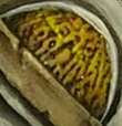
- Aged / Worn Metal (Copper Canister)
- An inconsistent mix of the two above techniques, splotchy, streaky.
- Will often have a duller appearance, never quite reaching a final highlight,
- Scratches, cuts, holes, etc will usually be shiny and stand out.
- Allowing brush strokes to be visible can be fine. (Within reason.) Look at the orange copper in the photo here.
 |
Black Armour - Dull from soft highlighting, contrasted
by the shinier gold rivets.
Gold Canister Caps - Shiny from large, blended highlights.
Gold Shoulders - Shinier from smaller highlights.
Copper Canister - Worn, from noticeable streaks / patches
Gold between canister caps and Copper - Worn, due
to not being fully highlighted and darker.
|
Examples of Sheen


 |
Blue Lamborghini via CarNewsChina.
Black Lamborghini 2015 via K. LeCrone.
Red Lamborghini via Pintrest.
|
- Blue Car
- A perfectly shiny surface is a mirror that reflects exactly what faces it. So if you shine a lamp at something, you see the light bulb, the lamp, etc. "Chrome" fits into this category and so do some "High Gloss" finishes.
- Black Car
- As the surface becomes less reflective, it becomes "Gloss." This is a shiny finish that reflects light in easy to see spots. So, kind of like a mirror, but if you can't make out all the details.
- This car might better be described as "Satin" since it's still reflecting sharp lights, but you probably couldn't make out the shape of your face if you looked.
- Red Car
- As the surface becomes dull, it's called "Matte." There's no reflection and light spreads out over a wide area.
Metallic Formulas
The first step to learning to paint NMM is the process of recognizing which colours compose the metal you're trying to achieve. After you've got your paints together, the other thing is to recognize that highlights will usually be focused in one area, a strip or edges. (Look at a pot in the kitchen and see how the light intensifies in one area.) If you're looking to inspiration, google it. Seriously. Type "gold" or "platinum" or whatever into Google, search and hit the little "Images" link to see exactly what you're trying to recreate.
Paint using a range of browns and yellows. For duller gold, use less (or darker) yellow. (Like in the blue/gold shoulder pictured at the beginning of the article.)
For this shoulder, I layered, in order: Snakebite Leather, Devlan Mud, Vomit Brown and Cygnus Yellow. I did very much the same below, but added a layer of Menoth White at the end to create a stronger shine.


Very similar to gold, except you'll want to use brown, then oranges, then finally elf flesh instead of yellows.
In this case, I've used subtle brush strokes and pulled in more of the darker browns to create an aged look.

These are typically shades of grey. The shades of paint you use controls the darkness of these grey metals. Save white for the highlights.
Platinum tends to be seen as either a black metal with some grey highlights and strong white highlights or a white metal with lots of grey shades and some black shades.

Similar to steel, but I like to add blue-grey tints to iron metals. Adding some blue is also a way to add variety to a model that has a lot of grey and create a "cool" (as in "cold") grey appearance.
I allowed myself to get a little more artistic and creative on the chest armour below, including brush strokes along with the NMM.
Started with a deep blue-grey, followed by dark then light grey layers, deepened with a black wash and finally a couple more layers of light grey.

No comments :
Post a Comment
Please keep all comments civil and language appropriate for a child-safe environment.